Smart Sidebar Slider not adjusting size

Author
Topic
#3107

I am using one sidebar slider, bottom anchored, which works okay for all three desktop browser tests I have run.

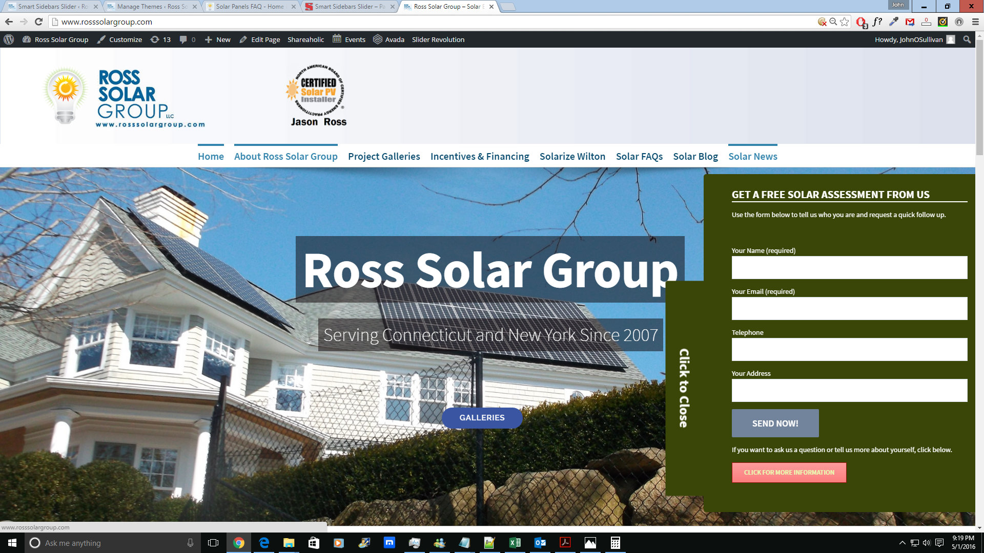
But it does not reduce in size or adjust for a mobile screen (Android, Chrome browser). I do not find any specific settings to change this. I have added a screenshot from desktop (at standard zoom) and from the mobile device. The sidebar is larger than the screen on the mobile.

Can I set or adjust this?

Viewing 5 replies - 1 through 5 (of 5 total)
Author
Replies
  • #3114

    I can’t replicate this. It works on 3 Android devices with different Android versions and screen sizes.

    But, there are some limitations: if you load page in the landsacape view, and rotate to portrait, contact form can’t resize horizontally. I plan to make complete rewrite of the way contact form is displayed, but that requires a lot of time, and I am not sure when that will happen.

  • #3121

    Thanks for that reply. Is there at least a setting to adjust to control how much it changes in size for mobile? It doesn’t seem to adjust as much as the site theme does. I am comparing the size of the tab and container text versus the body text of the pages.

    Right now my only options appear to be to resize the container and the tab so that it will work on both but require people to scroll in all cases. That is, the form will be larger than the container even on a full desktop screen. This is the site. It may be changed by the time you click.

    Thanks,
    John

  • #3122

    As an update, I am able to satisfy my client’s needs with the current settings as I type this with one exception. It never works with two Android phones or an iPhone I am testing with when they are oriented in landscape. I can reload the pages, but the sidebar doesn’t change height. Width is acceptable. I experimented allowing the container to adjust to “full size”, but that did not improve the landscape/mobile results. It currently remains set to allow “full size.”

    Forcing a form scroll is not an issue, so if there is a way to have the sidebar better adjust to a landscape orientation that is what I need.

  • #3123

    I plan to do more testing soon, and I will have few new devices to run some tests in different orientation. It will take some time, but I expect that next major version will improve on current mobile support.

  • #3124

    Thanks.

    For what it’s worth, I have spoken to a few other people who do more website development than I do. Their opinion is that the trend in the industry is to not put too much effort into making landscape orientation work for input fields. With most devices running mobile OS, the keyboard takes up so much space that only a little slit is left to view the website on fields on a form. Tablets may be an exception, but they also render closer to what displays on a desktop.

    For now we will simply expect a site visitor to be using portrait mode for any input.

Viewing 5 replies - 1 through 5 (of 5 total)
  • The topic ‘Smart Sidebar Slider not adjusting size’ is closed to new replies.